





Re-imagining MTF for traders
From a hidden feature to a complete product experience


Imagine 2 people walk into a store with ₹10,000 each.
The first person buys a smartphone worth ₹10,000. Simple. Within budget.
The second, however, knows of a special scheme: he only needs to pay 25% upfront, and the store will cover the rest. With his ₹10,000, he can now pick a smartphone worth ₹40,000, because the store funds the remaining ₹30,000 as a loan.

Both walked in with the same budget, but one walked out with 4x the value, simply because he knew about the scheme.
That’s exactly what Margin Trading Facility (MTF) does in stock market - it multiplies your buying power. It lets you borrow additional funds against the stocks you already own, so you can trade bigger, and earn bigger profits.
The problem however, wasn't that traders didn't know about MTF. They did. The challenge was its discoverability inside Ventura's platform, and more importantly, lack of a clear value proposition. MTF existed, but hidden away.
And that was the challenge we set out to solve.


When we looked into data, we realised something surprising:

Despite having a dedicated order tab in the transaction widget, almost no traders were using the MTF facility.
Why? Because its value proposition was never clearly communicated. Traders weren't rejecting it, they just didn't realise what this facility could do for them.
So, we went back to our desks, pulled together research, user insights, and rounds of ideation, and asked ourselves:
What if MTF wasn’t just a feature? What if it was treated as a full-fledged product, with its own narrative and its own visibility?
That's when the idea of productising MTF came through.
We reframed MTF not as just "another order tab", but as a product in itself.

By giving MTF its own space in the trading journey, we were able to clearly communicate its value proposition.
Contextual nudges throughout the journey
The biggest undiscovered benefit of MTF is that it allows you to "increase your buying power". And that message had to meet users right at moments where they'd be making decisions.
So, instead of generic banners, we designed contextual nudges:

The idea was simple: to nudge at the right time, with the right message. Each one reframed MTF as a solution to the immediate pain point that the trader may face.
And to make these nudges even sharper going forward, we partnered with the data team to capture insights from clicks - helping us refine when and where these prompts worked best.
Answering all the What's and How's of MTF


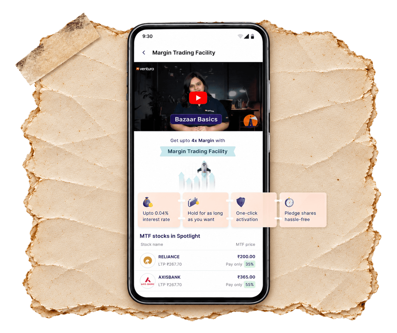
Instead of hiding these answers in jargon-heavy documents or help articles, we designed a dedicated MTF page; a single place that explained:
What MTF is: Through a quick, 30-second video.
Why it's valuable: Highlights low interest rates, unlimited holding period, one-click activation.
How it works in practise: FAQs that addressed common doubts in plain language.
A curated list with upfront margin benefit
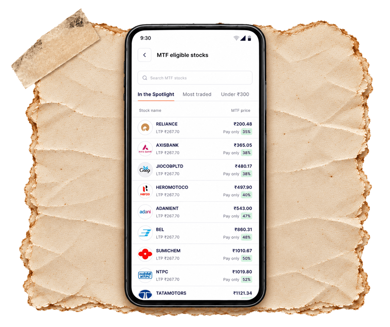
For many first-time traders, the biggest question isn't about how MTF works, but where to begin. Which stocks are eligible? What’s the actual margin advantage?
To make that first step effortless, we curated a list of handpicked stocks, each with the margin benefit highlighted upfront. Traders could instantly see how much price they'd have to pay against the current LTP.
Visibility at the moment of truth - the transaction widget
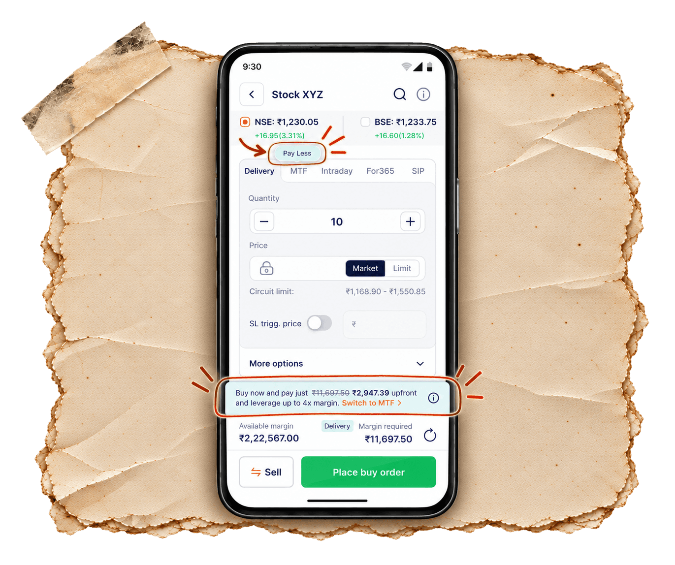
Here's something we knew about designing for the Indian audience: the "discount" model works like a charm. Whether it's a supermarket shelf flashing "Pay ₹199 instead of ₹299" or an e-commerce cart showing "You saved ₹1000 today", the psychology is universal: visible savings at the moment of truth drives action.

And for us, that moment of truth was the transaction widget, right when the order is about to be placed.
So instead of hiding MTF away in a separate tab, we brought it right into the decision point, showing the margin advantage clearly: a CNC trade that normally required ₹11,697 now showed up as “Pay just ₹2,947 with MTF”.
MTF was no longer a vague "facility". It had tangible value.

Visibility at the moment of truth - the transaction widget
Here's something we knew about designing for the Indian audience: the "discount" model works like a charm. Whether it's a supermarket shelf flashing "Pay ₹199 instead of ₹299" or an e-commerce cart showing "You saved ₹1000 today", the psychology is universal: visible savings at the moment of truth drives action.

What good is a powerful feature if no one sees its value?